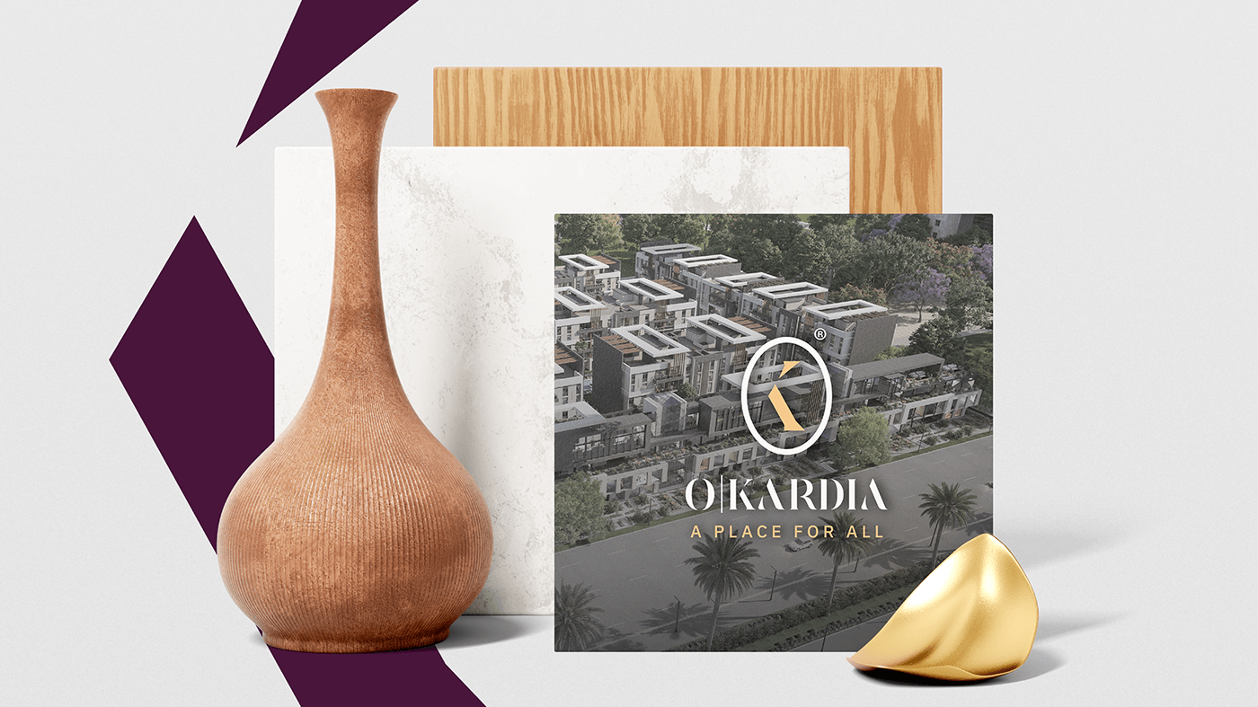
The "Okardia" logo consists of the letters "o" and "k," representing Obour city and heart respectively. The letter "o" symbolizes the city of Obour City in a circular shape, adjacent to the letter "k" representing the heart, signifying the project's importance as a vital hub for communication and convergence in the area. To enhance this concept, the colors magenta and beige were chosen to represent the warm spirit and refined aesthetics of the project.PROJECT COMPONENTS – MIXED USE PROJECT (Offices-Clinics-Retail)