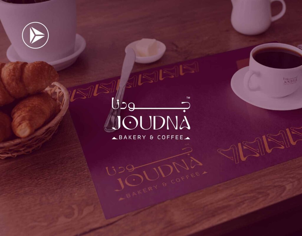
Joudna Bakery & Coffee
Joudna Bakery & Coffee Home Joudna Bakery & Coffee Joudna Is Based On Our Original Customs And Our Inherited Presence, Drawing A Future For A Valuable And High-Quality Experience For All Our Products Watch on Website https://reviewmar.com/wp-content/uploads/2024/07/RENDER_ME.mp4https://reviewmar.com/wp-content/uploads/2024/07/Comp-1.mp4
Read More