okardia

Okardia

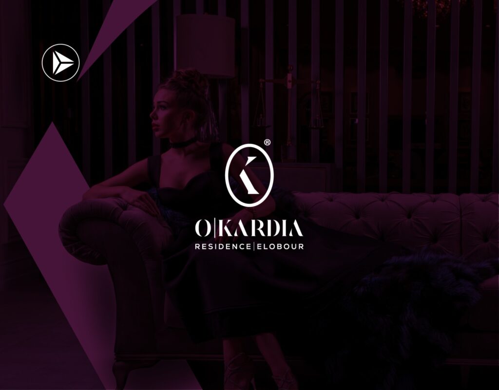
Okardia Home Okardia The "Okardia" logo consists of the letters "o" and "k," representing Obour city and heart respectively. The letter "o" symbolizes the city of Obour City in a circular shape, adjacent to the letter "k" representing the heart, signifying the project's importance as a vital hub for communication and convergence in the area. To enhance this concept,…

Read More
fud

FUD

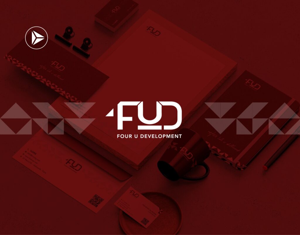
FUD Home Four U Development A logo was designed that reflects the vision and values of Four U Development in a distinctive style that attracts attention. A website was designed with modern technologies and an easy-to-use user interface to enhance the user experience. A group of high-quality print advertisements was also created to increase brand awareness, promote products and…

Read More
Trivium

Trivium

Trivium Home Trivium Square Mall The TRIVIUM name was created especially for this exclusive. integrated real estate development and it depicts the unique offerings that the property provides The name is centred on the concept of the three different business lines that the property serves; i.e. Offices - Clinics - Retail Emulating the three main elements of life; earth,…

Read More
×